
Olive skin is famous for “breaking the rules.” It can read warm in one mirror, cool in another, and neutral by the end of the day—especially when lighting, hair color, makeup, or a nearby color shifts the overall effect. Instead of chasing one label forever, the most reliable approach is to notice how your undertone behaves and then build a small, repeatable palette: a few bold shades that brighten your face, supportive neutrals that mix easily, and metal accents that keep outfits looking intentional. For more guidance, see [PDF] The Small Stuff of Roman Antiquity – University of California Press.
Olive undertones often carry a green-gray or golden-ashy cast. That’s why a “safe” shade (like a muted beige or dusty pastel) can sometimes make the complexion look dull—while a saturated jewel tone can make the skin look clearer and the eyes brighter. For further reading, see [PDF] Trans Reads – Trap Door.
Depth matters less than behavior: light, medium, and deep olive can share the same wins near the face. The bigger swing factors tend to be context: the top you wear closest to your jawline, your makeup undertone, and the lighting (daylight vs. warm indoor bulbs).
A practical strategy: pick a small set of high-impact shades you trust near the face (tops, collars, scarves, earrings), then expand with neutrals and accents so getting dressed feels fast and consistent.
Warm-leaning olive typically looks best in sunlit, golden, and earthy shades. Cool-leaning olive often shines in crisp contrast and jewel tones. Balanced olive can wear both—yet still benefits from clean saturation rather than chalky, dusty pastels.
Use a “near-the-face test” in daylight: try two tops back-to-back (one warm, one cool). The better choice makes the whites of the eyes look clearer, reduces shadows around the mouth/under-eyes, and makes skin look more even.
| If this happens often… | Likely direction | Try more of these | Be cautious with |
|---|---|---|---|
| Gold jewelry blends in; beige looks flattering | Warm-leaning olive | Warm emerald, teal, terracotta, tomato red, camel | Icy pastels, bluish gray, stark white |
| Silver looks crisp; bright white feels clean | Cool-leaning olive | Cobalt, fuchsia, true red, deep plum, charcoal | Very yellow mustard, orange-heavy browns |
| Both metals work; you can wear many brights | Balanced olive | Jewel tones, clean neutrals, saturated accents | Dusty beige-pinks, ashy taupe near the face |
If olive skin had a shortcut, it’s this: clear, saturated color often reads more flattering than “softened” versions. Jewel tones add contrast without washing you out, and they tend to look polished even in casual fabrics.
If bold feels intimidating, start with one bold piece near your face (a top, collar, scarf, or earrings) and keep everything else neutral. Another low-effort move: a neutral outfit plus a jewel-tone layer (cardigan, blazer, or lightweight jacket).
Neutrals matter because they sit next to your bold shades and determine whether an outfit looks cohesive or slightly “off.” Many olive undertones look stronger in deeper, cleaner neutrals than in pale, heathered ones.
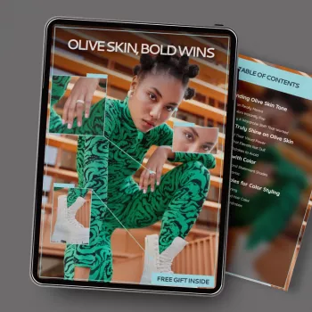
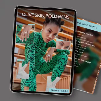
If you suspect olive undertones and want fewer “why does this look weird on me?” moments, Olive Skin, Bold Wins – Olive Skin Tone Color Guide eBook is built around practical decisions: what to wear near the face, which neutrals mix the easiest, and how to add bold accents without overthinking.
For anyone who likes tracking wardrobe goals (like building a capsule, planning outfits for a month, or staying consistent with a style direction), pairing it with a simple progress system can help. The Creative Hobby Progress Tracker Ideas – Digital Ebook Guide can be repurposed as a weekly outfit or wardrobe-building tracker: “wore my best face colors,” “tested two new neutrals,” “decluttered one off-tone top,” and similar habits that make results add up.
In daylight, compare a warm top (camel, terracotta, warm teal) and a cool top (cobalt, fuchsia, charcoal) right under your face; the better one brightens eyes and evens skin. Check jewelry too: if gold looks seamless and cream feels fresh, you may lean warm; if silver looks crisp and bright white feels clean, you may lean cool.
Overly dusty pastels, yellow-beiges, and some ashy grays near the face are common culprits. If that happens, switch to clearer jewel tones, deepen the neutral (charcoal/navy/espresso), or move the tricky shade to bottoms instead of tops.
Start with 2–3 flattering “face colors,” add 2 core neutrals for bottoms/outerwear, then choose 1–2 accents. Example: warm-leaning olive can try cream + espresso with teal and tomato red; cool-leaning olive can try white + charcoal with cobalt and deep plum.









Leave a comment