
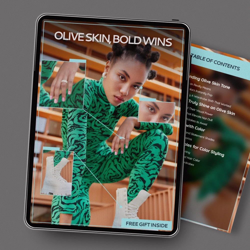
Olive skin tone is considered less common than the broad “fair,” “medium,” or “deep” labels, mainly because it’s defined by undertone (a green-gray cast) rather than depth alone. You can find olive undertones across many skin depths, but it’s still a smaller slice of the overall undertone spectrum compared with clearly warm (golden/peach) or cool (pink/blue) undertones. That mix of “not quite warm, not quite cool” is exactly why it can feel rare when you’re shopping—many foundations and color guides don’t separate olive as its own lane.
Olive often gets misread as warm because the skin may tan easily or look golden in certain lighting. The difference is that olive skin tends to look slightly muted or smoky rather than bright, and some shades pull orange or too pink once applied. If you’ve ever tried a “neutral” base that still looks off, you may be closer to olive than you’ve been told.
Many people with olive undertones notice that gold jewelry can look good, but certain yellow-golds feel loud, while rose gold can be surprisingly flattering. Some greens, teals, and earthy tones make your complexion look clear, while very icy pastels can make it look gray. In makeup, peachy nude lipsticks may turn orange, and cool mauves can suddenly look perfect.
Our team recommends leaning into “muted” color families: olive, sage, khaki, taupe, cocoa, and soft charcoal. For makeup, look for base shades labeled olive, golden-olive, or neutral-olive; choose bronzers that read more neutral-brown than orange; and pick blushes in muted rose, soft berry, or terracotta-brown rather than bright coral. For clothing and accessories, balanced neutrals (cream, mushroom, warm gray) and rich jewel tones (emerald, burgundy, deep teal) tend to look polished without overpowering your undertone.
For a deeper breakdown of olive undertones—plus bold shades and best neutrals—visit our guide here: https://freshtrendshelf.com/guide-olive-skin-color-guide-bold-shades-best-neutrals/.
Muted earthy shades (olive, taupe, cocoa) and saturated jewel tones (emerald, burgundy, deep teal) are usually the easiest wins. Balanced neutrals like cream and warm gray also tend to look naturally harmonious.










Leave a comment